Why Mobile SEO Transforms Your Digital Success

More people now access the internet through their mobile devices than ever before. This shift has fundamentally changed how we approach Search Engine Optimization (SEO). Mobile SEO is no longer optional; it's essential for a successful online presence. Businesses must adopt a mobile-first mindset to thrive.
Understanding The Mobile-First Landscape
Traditional desktop SEO strategies often don't translate well to mobile. Desktop websites are designed for larger screens, mouse navigation, and faster internet speeds. Mobile users, however, expect a smooth experience on smaller screens with touch navigation and often slower connections. This requires a dedicated mobile SEO approach.
For example, a website with small fonts, complex navigation, and slow loading times might rank well on desktop. But it could provide a frustrating mobile experience, leading to high bounce rates and lower mobile rankings.
Google's Mobile-First Indexing: A Game Changer
Google's move to mobile-first indexing reinforces the importance of mobile SEO. Google primarily uses the mobile version of your website for indexing and ranking. So, even a perfectly optimized desktop site won't perform well if the mobile experience is poor. This impacts technical optimization, content presentation, and user experience.
Mobile SEO is crucial given the sheer volume of mobile searches. Mobile devices account for 83.58% of all Google visitors as of 2025. This highlights the necessity of optimizing for these users. Organic click-through rates (CTR) on mobile are about 50% lower than desktop, further emphasizing the need for responsive design and fast loading. With 87% of smartphone owners using a search engine daily, prioritizing mobile SEO significantly impacts visibility and traffic. Find more detailed statistics here.
The Benefits of A Robust Mobile SEO Strategy
Effective mobile SEO doesn't just improve rankings; it transforms your entire digital presence.
- Reach a Wider Audience: Connect with the majority of users who primarily browse on mobile.
- Enhance User Experience: Create a seamless and positive experience that encourages engagement and conversions.
- Boost Brand Credibility: Show you value your mobile audience, building trust and loyalty.
- Gain a Competitive Edge: Outperform competitors who haven't prioritized mobile.
Investing in robust mobile SEO is investing in your digital future. It connects you with your audience where they are, providing the information and experiences they need, when they need them.
Technical Mobile SEO That Actually Moves Rankings
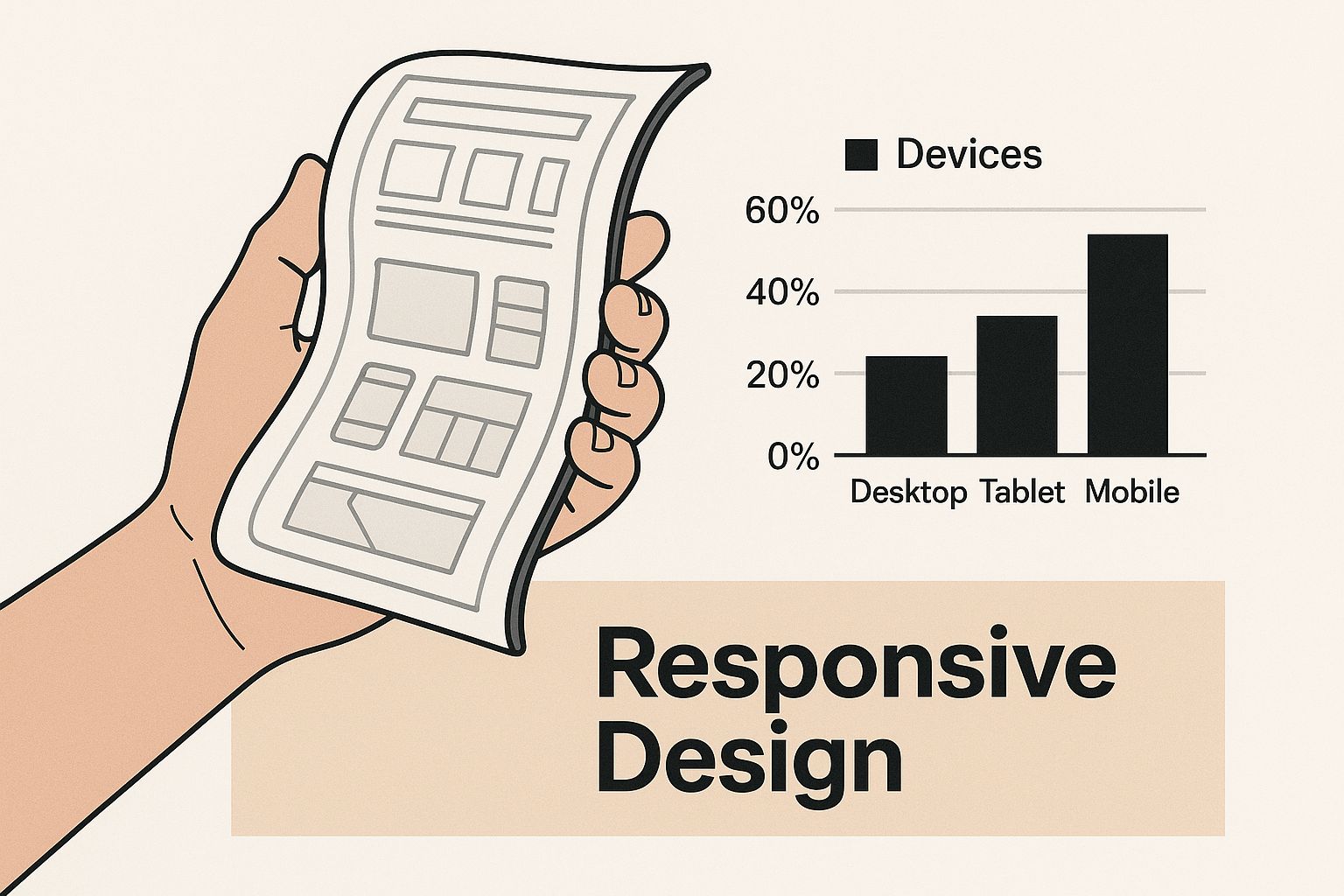
The infographic above illustrates how responsive design adapts to different screen sizes. This ensures a consistent user experience across the variety of devices used today. Essentially, it shows how content reflows to fit any screen, a cornerstone of positive mobile user experience and critical for your mobile SEO checklist.
Beyond responsive design, your site’s technical foundation is crucial for mobile SEO success. This means optimizing elements that Google’s algorithms prioritize, such as Core Web Vitals, and using techniques for enhanced mobile performance. A visually appealing website on a phone is useless if it loads slowly; users will leave, negatively impacting your rankings.
Core Web Vitals and Mobile Performance
Core Web Vitals measure real-world user experience on your site. These metrics include Largest Contentful Paint (LCP), First Input Delay (FID), and Cumulative Layout Shift (CLS). They quantify loading speed, interactivity, and visual stability, which are key for mobile user experience and any effective mobile SEO checklist.
- Largest Contentful Paint (LCP): Optimize images, use a CDN, and prioritize above-the-fold content for better LCP scores.
- First Input Delay (FID): Minimize JavaScript execution time and optimize third-party scripts to reduce FID.
- Cumulative Layout Shift (CLS): Use fixed dimensions for images and ads, and avoid inserting new content above existing content to improve CLS.
To help you optimize your site for Core Web Vitals, here’s a handy checklist:
Core Web Vitals Optimization Checklist A comprehensive comparison of performance metrics and optimization techniques for mobile sites
| Metric | Target Score | Common Issues | Quick Fixes |
|---|---|---|---|
| Largest Contentful Paint | < 2.5s | Slow server response times, render-blocking resources, large image sizes | Optimize images, use a CDN, prioritize above-the-fold content |
| First Input Delay | < 100ms | Long tasks, excessive JavaScript execution | Minimize JavaScript, optimize third-party scripts, defer non-critical JavaScript |
| Cumulative Layout Shift | < 0.1 | Images without dimensions, ads injected dynamically, content reflow | Use fixed image dimensions, reserve space for ads, avoid inserting content above existing elements |
This table summarizes the target scores for each metric, common issues that prevent achieving these targets, and some quick fixes you can implement. Focusing on these areas will significantly improve your mobile site's user experience.
Crawling, Indexing, and Technical Structure
Optimizing your site for mobile-specific crawling is vital. This involves ensuring Googlebot can easily access and index your mobile pages. Proper structured data implementation helps search engines understand your content. A well-defined site hierarchy, clear URLs, and an up-to-date sitemap also contribute to improved crawling and indexing.
Image Optimization and Touch-Friendly Interfaces
Optimizing images is crucial for mobile. Compressing images, using formats like WebP, and implementing lazy loading drastically improves page speed. Designing touch-friendly interfaces with appropriately sized buttons and interactive elements improves user experience, boosts engagement, and reduces bounce rates. These technical improvements will lead to noticeable ranking gains. You can implement these changes today using That's Rank’s suite of SEO tools.
Local Mobile SEO Strategies That Convert
Local mobile search is a goldmine, particularly for businesses targeting a local customer base. It's the primary way potential customers search for immediate solutions. Optimizing for this segment can significantly impact your conversions. However, mastering local mobile SEO requires understanding how mobile users search, which differs from desktop searches.
Optimizing Your Google My Business Profile
Your Google My Business (GMB) profile is the cornerstone of local mobile SEO. It dictates how you appear in Google Maps and local search results. Ensure your GMB profile is accurate, complete, and updated regularly. Include high-quality images, accurate business hours, and a compelling business description.
Customer reviews play a vital role, as positive reviews influence potential customers. Actively manage your GMB profile by responding to reviews and questions, and posting updates to keep your audience engaged. This shows you are responsive and value customer interaction.
Leveraging Location-Based Search Behavior
Mobile users frequently search using location-based keywords like "near me" or by specifying a neighborhood. Incorporate these keywords naturally within your website content, title tags, and meta descriptions.
For example, a pizza restaurant in Brooklyn might use phrases like "best pizza in Brooklyn" or "pizza delivery near me in Brooklyn." This helps your business appear in relevant local search results. Creating location-specific landing pages can further improve visibility for specific local audiences.
Capturing "Near Me" Search Traffic
"Near me" searches are incredibly prevalent on mobile. To capture this traffic, ensure your website is optimized for local intent. Use location-based keywords throughout your content and optimize your website for mobile speed and user experience.
Implement schema markup with location data to provide search engines with more context about your business and location. This helps search engines understand your relevance to local queries, increasing visibility in "near me" results. A smooth, fast mobile experience encourages conversions.
Local search is crucial for mobile SEO, especially for businesses targeting local customers. Google My Business is a powerful tool for managing your online presence across Google Search and Maps. 30% of all mobile searches are location-related, and 18% of local mobile searches lead to a purchase within a day, highlighting the potential for immediate conversions.
Optimizing for local SEO increases visibility and reach. With 60% of users discovering new companies or products on their smartphones, mobile SEO can drive brand awareness and customer acquisition. Explore this topic further here.
Mobile Local Content Optimization and Link Building
Creating mobile-friendly local content is essential. Keep content concise, using headings and bullet points for readability. Optimize images for mobile devices, ensuring fast loading times. Focus on valuable information that answers local searchers' questions and addresses their needs.
Building local backlinks from reputable sources boosts local mobile SEO. Consider partnerships with local businesses, sponsorships of community events, and participation in local online directories. These efforts build a strong online presence, improving your chances of converting mobile searchers into paying customers. Check out our guide on How to master local SEO for more insights.
Content Optimization For Mobile Search Success
Creating content that performs well on mobile devices requires a different approach than desktop content strategies. Successful websites tailor their content creation and optimization specifically for mobile user behavior. This means striking a balance between providing comprehensive information and a mobile-friendly presentation. It also means understanding how to structure even long-form content in a way that keeps mobile users engaged.
Structuring Content for Mobile Engagement
Effective mobile optimization begins with content hierarchy. Use clear headings (H1-H3) to divide the text and make it easily scannable. Bullet points and short paragraphs are also essential. Keep in mind how people typically consume content on their phones: they scroll quickly and often skim. Your goal is to make it easy for them to find the specific information they're looking for. Furthermore, internal links should be easy to tap with a finger, which improves navigation and the overall user experience.
Optimizing for Mobile Search Intent
Mobile users often have different search intentions than desktop users. They might be looking for quick answers, local businesses, or information on the go. This means your keywords need to reflect these mobile-specific needs. Consider using question-based keywords and "near me" searches. Your content should also address these queries directly and concisely. For instance, if someone searches for "best coffee shop near me," the content should immediately display nearby options, not a lengthy history of coffee.
Leveraging Mobile Content Formats
Some content formats are particularly well-suited for mobile devices. Short videos, infographics, and interactive elements can significantly increase user engagement. These formats cater to shorter attention spans and provide a more dynamic user experience. Think about how you can incorporate visuals and interactive content to break up large blocks of text and deliver valuable information in engaging ways.
Content length and quality are crucial components of any mobile SEO checklist. Research shows that content exceeding 3,000 words receives 3x more traffic than content of average length (around 1,400 words). This longer content also earns 4x more shares and 3.5x more backlinks, both of which are vital for SEO. Find more detailed statistics here. However, length is beneficial only if the content is optimized for mobile. This means using responsive images, ensuring fast page load speeds, and making sure the content is easy to read on smaller screens. Given that 92.3% of internet users access the web via mobile phone, mobile optimization can dramatically increase your content's reach. A well-structured, mobile-friendly website is essential for taking advantage of the SEO benefits offered by longer-form content. Use tools like those provided by That's Rank to track your keyword rankings, monitor your search positions, and audit your website's mobile performance. This will ensure you are providing mobile users, and search engines, with the best possible experience.
Mobile User Experience That Drives Rankings

Mobile user experience (UX) is crucial for your mobile SEO checklist. It directly impacts search rankings by influencing how users interact with your site on their phones. Understanding mobile user behaviors and expectations is key to a successful mobile SEO strategy. This involves creating experiences that engage visitors and are optimized for search engines.
Designing For Mobile User Behavior
Mobile users are often on the go, looking for quick answers and seamless experiences. They expect websites to load instantly and be easily navigable using their thumbs. Designing for this behavior is paramount for lowering your bounce rate and improving rankings. This translates to a clear visual hierarchy, simplified navigation, and large, tappable buttons.
Imagine someone searching for a local restaurant on their phone. A site with a cluttered layout, small fonts, and complicated navigation will likely be abandoned. However, a site that loads quickly, clearly displays the restaurant's location and menu, and has a prominent "call" button will likely create a positive user experience.
Navigation and Forms Optimized For Touch
Intuitive mobile navigation is essential. This involves a clear menu structure, minimizing clicks to reach key information, and implementing search functionality. Forms should also be optimized for touch input. Form fields should be large and easy to tap, and the form itself should be short and straightforward to minimize user effort. This attention to detail improves user engagement and conversion rates, indirectly influencing search rankings.
Visual Hierarchy on Smaller Screens
Effective visual hierarchy on smaller screens prioritizes the most important information. This might involve using larger font sizes for headings, strategically placing calls to action, and using white space effectively. Images should be optimized for mobile viewing, ensuring they load quickly and scale properly across different screen sizes. You may be interested in learning more about mobile optimization. This careful organization guides users to essential information and encourages further exploration.
To help illustrate the relationship between mobile UX and SEO, let's look at a comparison table:
Mobile UX vs SEO Impact Comparison
Analysis of how different mobile UX elements directly affect search engine rankings and user engagement
| UX Element | SEO Impact | User Benefit | Implementation Priority |
|---|---|---|---|
| Page Speed | Faster loading times improve ranking and reduce bounce rate. | Quick access to information, less frustration. | High |
| Mobile-Friendly Design | Ensures site is accessible and usable on all devices, improving ranking. | Consistent experience across devices. | High |
| Clear Navigation | Improves user engagement, reducing bounce rate and signaling positive relevance to search engines. | Easy to find information, encourages exploration. | High |
| Touch-Optimized Forms | Simplifies conversion process, indirectly improving rankings through increased user engagement. | Less effort required for completing forms, leading to higher conversions. | Medium |
| Visual Hierarchy | Guides users to essential information, improving engagement and reducing bounce rate. | Easier to scan and understand content. | Medium |
This table highlights the crucial connection between a positive mobile UX and improved SEO performance. By prioritizing these elements, websites can enhance both user satisfaction and search visibility.
Reducing Bounce Rate and Encouraging Engagement
High bounce rates signal to search engines that users aren't finding what they need, negatively affecting rankings. Address this with clear calls to action, relevant content, and a mobile-friendly design that prioritizes speed and usability. By creating engaging experiences, you encourage users to stay on your site longer, which sends positive signals to search engines and ultimately improves your rankings. These factors contribute to a positive mobile experience, leading to increased engagement, conversions, and higher search rankings.
Monitoring and Measuring Mobile SEO Performance
Effective mobile SEO isn't a set-it-and-forget-it endeavor. It requires continuous monitoring and optimization, much like tending a garden. You need to regularly evaluate your site's performance on mobile and adapt your strategy based on the data you collect. This consistent attention allows you to address issues and cultivate growth.
Essential Tools and Metrics for Mobile SEO
Several tools can help you keep track of your mobile SEO success. Google Analytics allows you to segment data by device, providing valuable insights into how mobile users interact with your site. Google Search Console offers data on mobile search queries, click-through rates, and any crawl errors specific to mobile. For a deeper understanding of SEO performance metrics, you might find this article helpful: How to master SEO performance metrics.
Key metrics to monitor include mobile page speed, bounce rate, dwell time, and conversion rates. These provide a comprehensive overview of your mobile site's effectiveness. Tracking your keyword rankings on mobile is also crucial. It helps you understand how your optimization efforts impact your visibility in mobile search results. Platforms like That's Rank offer dashboards to monitor these vital aspects of mobile SEO.
Setting Up Effective Monitoring Systems
A proactive monitoring system is essential. This involves setting up alerts for any significant fluctuations in key metrics, such as a sudden drop in mobile rankings or a spike in your bounce rate. Think of it like the dashboard in your car: warning lights alert you to potential problems so you can address them promptly.
Similarly, a good monitoring system for your website flags potential SEO issues, allowing for proactive optimization. This often involves automated tools that track metrics and send alerts based on predefined thresholds. Addressing these issues quickly prevents them from negatively impacting your overall SEO performance.
Conducting Mobile SEO Audits and Measuring Business Impact
Regular mobile SEO audits are key to identifying areas for improvement. A comprehensive audit examines all aspects of your mobile site, from technical SEO and content to the overall user experience. This helps pinpoint any weaknesses hindering your mobile performance.
It's also essential to measure the business impact of your mobile optimization efforts. Track metrics like mobile conversions, revenue generated through mobile, and lead generation. This data quantifies the return on your mobile SEO investment and informs future strategic decisions. By consistently monitoring, analyzing, and adapting your strategy, you ensure continuous improvement and long-term success in today's mobile-centric online world.
Your Mobile SEO Implementation Roadmap
This roadmap helps you put mobile SEO strategies into action. It breaks down the process into manageable phases, with clear priorities and timelines. This structured approach allows for continuous improvement and helps you stay ahead of the competition.
Phase 1: Immediate Mobile SEO Improvements (Within 1 Week)
This phase focuses on quick wins that can immediately boost your mobile performance.
- Mobile-Friendly Test: Use Google's Mobile-Friendly Test tool to identify usability issues. This test gives you specific recommendations for improvement.
- Page Speed Analysis: Run a page speed analysis using tools like PageSpeed Insights. Prioritize fixing significant speed issues, such as unoptimized images.
- GMB Optimization (for Local Businesses): Make sure your Google My Business profile is complete and accurate. This includes relevant keywords, correct business hours, and high-quality images.
These initial steps create a strong foundation for more significant improvements in the next phase.
Phase 2: Quarterly Mobile SEO Goals (Within 3 Months)
This phase addresses more complex, structural improvements that require more time but deliver significant results.
- Core Web Vitals Optimization: Work towards meeting Google's Core Web Vitals targets. This involves improving Largest Contentful Paint, First Input Delay, and Cumulative Layout Shift.
- Content Optimization for Mobile: Review your content to ensure it’s easy to read on mobile devices. Use shorter paragraphs, clear headings, and bullet points for better readability. Optimize images and videos for mobile consumption.
- Mobile Keyword Research: Research keywords specifically used by mobile users. Incorporate these keywords naturally within your content and meta descriptions.
By achieving these quarterly goals, you can significantly strengthen your mobile presence.
Phase 3: Long-Term Mobile SEO Strategy (Ongoing)
This ongoing phase is about continuous monitoring and adapting to changes.
- Regular Mobile SEO Audits: Perform regular audits to find new opportunities and address any emerging issues.
- Monitor Performance and Adapt: Continuously monitor your mobile SEO performance and adjust your strategy based on the data.
- Stay Updated: Stay informed about the latest mobile SEO trends and best practices. Mobile SEO is constantly evolving, so staying current is essential.
Following this roadmap enables you to create and maintain a strong mobile SEO strategy, leading to consistent improvements and a competitive edge. That's Rank provides the tools you need to track keywords, monitor performance, and audit your website. Check it out today to start optimizing your mobile presence.